Zynga Poker: Hand Clarity
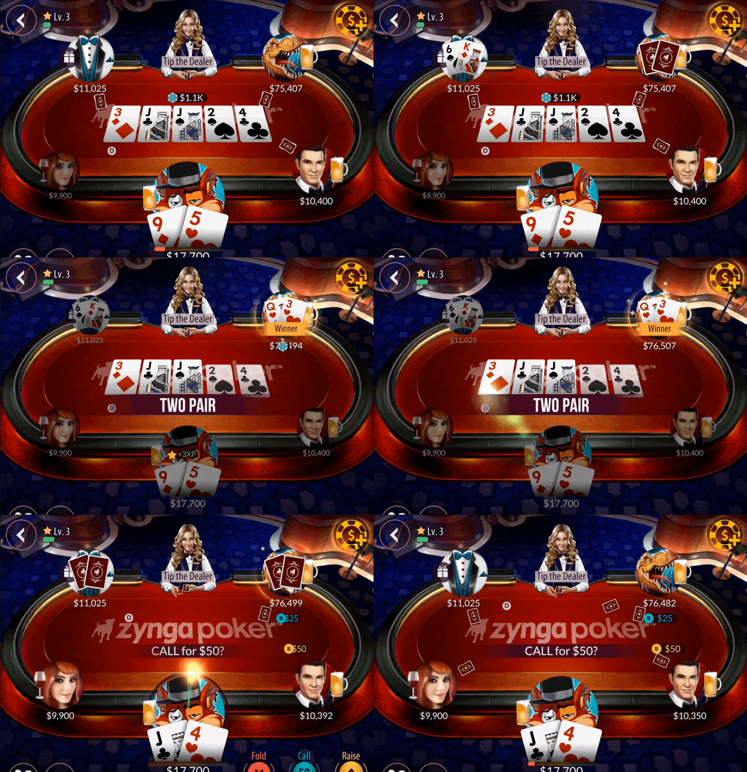
Players thought they had won hands they lost. I redesigned how the table shows who won and why.
- Employer
- Zynga
- Role
- Principal UX Designer
- Team
- 1 product manager, 1 engineer
- Scope
- Visual exploration, asset creation, implementation
- Year
- 2019
Summary
- Problem
- Players believed they had won and still lost. They asked for refunds and left 1-star reviews calling the game rigged.
- Hypothesis
- The table showed who won, but not why. Showing why would make a correct result look correct.
- Solution
- A kicker card in the banner explains ties. Winning cards glow, the rest dim, and a stronger banner names the hand.
- Result
- Shipped to all players at once, alongside other changes. Its effect wasn't measured on its own.
The problem
Players called the game rigged in 1-star reviews and asked customer service for refunds. Lower ratings mean fewer new installs, so the product team was asked to look into it. I don't have the call count.
The causes came from the team's experience with the game, and mine from years on it, rather than a formal study.
- Too fast. The pause between rounds was too short to confirm who had won.
- Side pots. Side pots and their payouts are hard to understand and hard to show clearly.
- Hand rankings. Some players didn't know what decides the winner when two players hold the same hand.
The hypothesis
The table showed who won, but never why. When two players held the same hand, nothing on screen explained the result, so a correct result could look rigged. If the table showed why a hand won, players would have less reason to doubt it.
I proposed five changes that were simple and quick to build.
- Lengthen the pause between hands.
- Reposition the winner's hole cards so they are easier to see.
- Show side pot payouts clearly.
- Dim the community cards that aren't part of the winning hand.
- Add stronger visual indicators to the winning hand.
I wanted the longer pause, but the engineers judged it too complex, so it was dropped. The visual changes were quick to release.
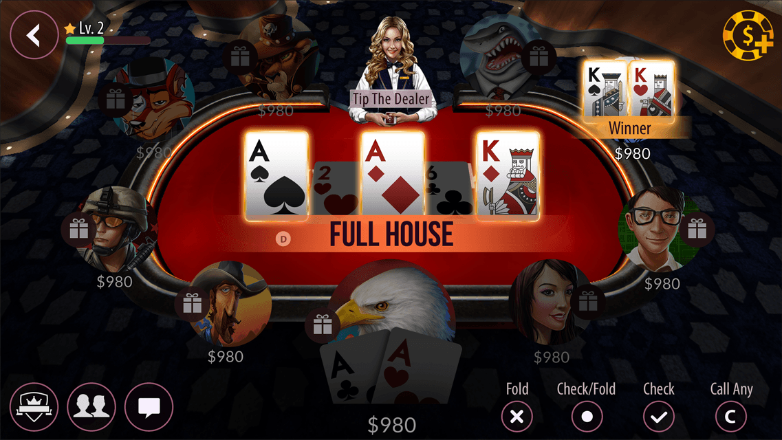
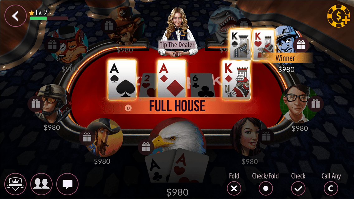
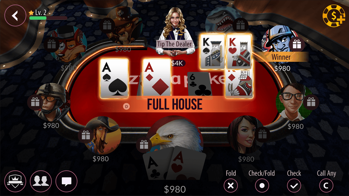
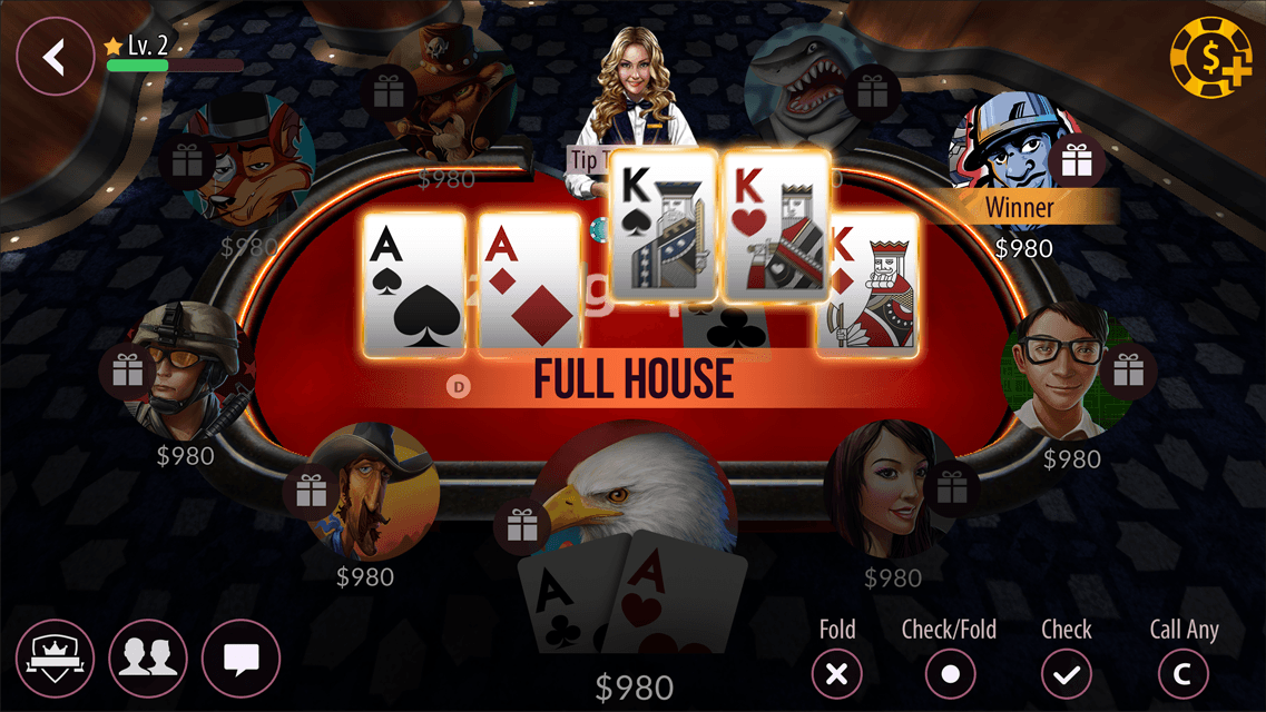

Adjusting each part on its own still wasn't clear enough, so I pushed the banner further.

The final design
The kicker card
The biggest single change. When two players hold the same hand, the next-highest card decides the winner. Before, nothing showed that card, so it wasn't clear why one hand beat the other. Showing it in the banner explains the result and teaches the rule.

Supporting changes
The rest make the winning hand easier to see at a glance. Each player who receives a side pot also gets a labeled tag underneath.


Outcome
- Shipped to all players at once.
- Other features changed at the same time and there was no holdout group, so this update's effect on ratings and refund calls wasn't measured.
Reflection
- I would size the problem with support and review data before designing, instead of relying on our sense of it.
- A holdout group on the old table would have separated this change from the others.
- The pause between hands is the one cause we couldn't address directly.